Runway Paper / Brand
Brand Guide
One masthead, three colours, two typefaces, zero decoration. Everything downloadable below is outlined vector — no fonts required.
Masthead (primary)
The stacked masthead. Default mark for covers, social, and anywhere it gets room to shout.
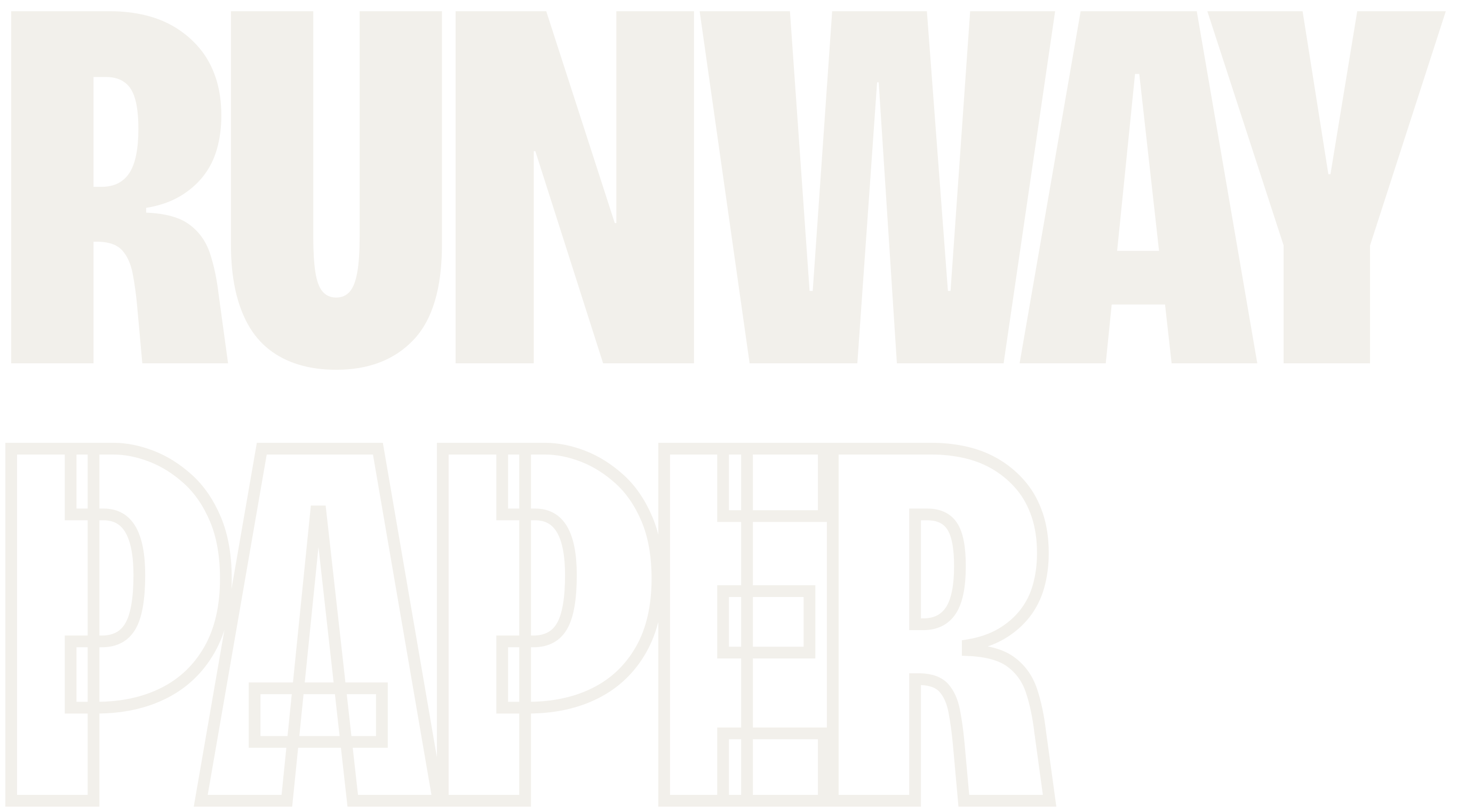
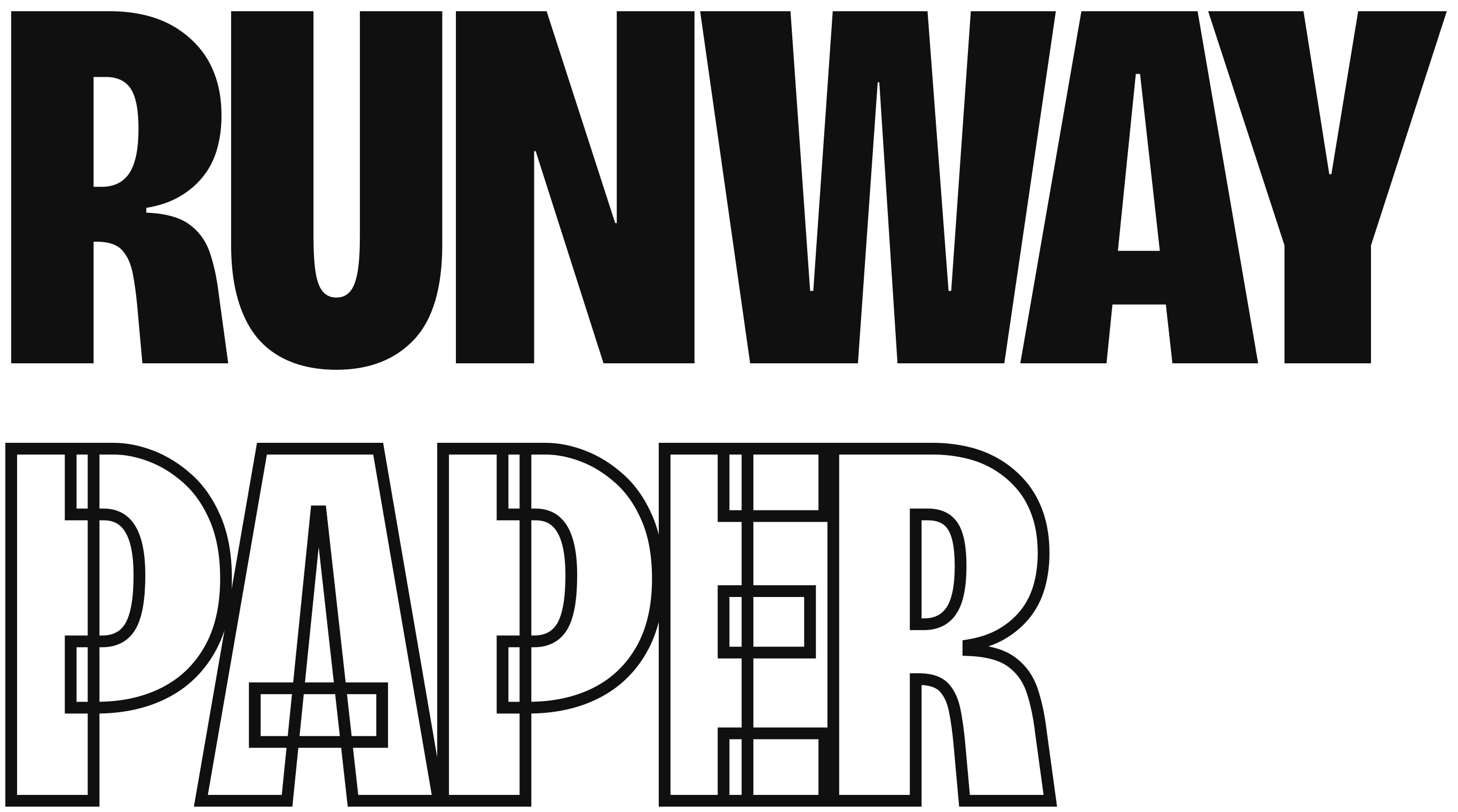
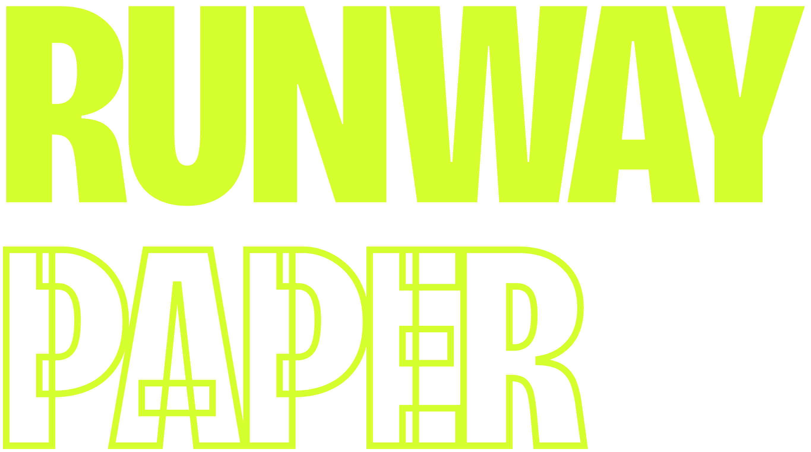
Wordmark (horizontal)
One-line lockup for headers, footers, partner strips. RUNWAY solid, PAPER outlined — always.



Wordmark (one-colour)
All-solid cut for small sizes, embroidery, single-colour print — anywhere the outline would die.


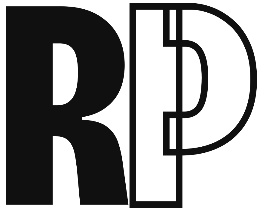
RP monogram
Avatar, favicon, stamp. The tile versions are pre-padded for profile crops.



Step & repeat
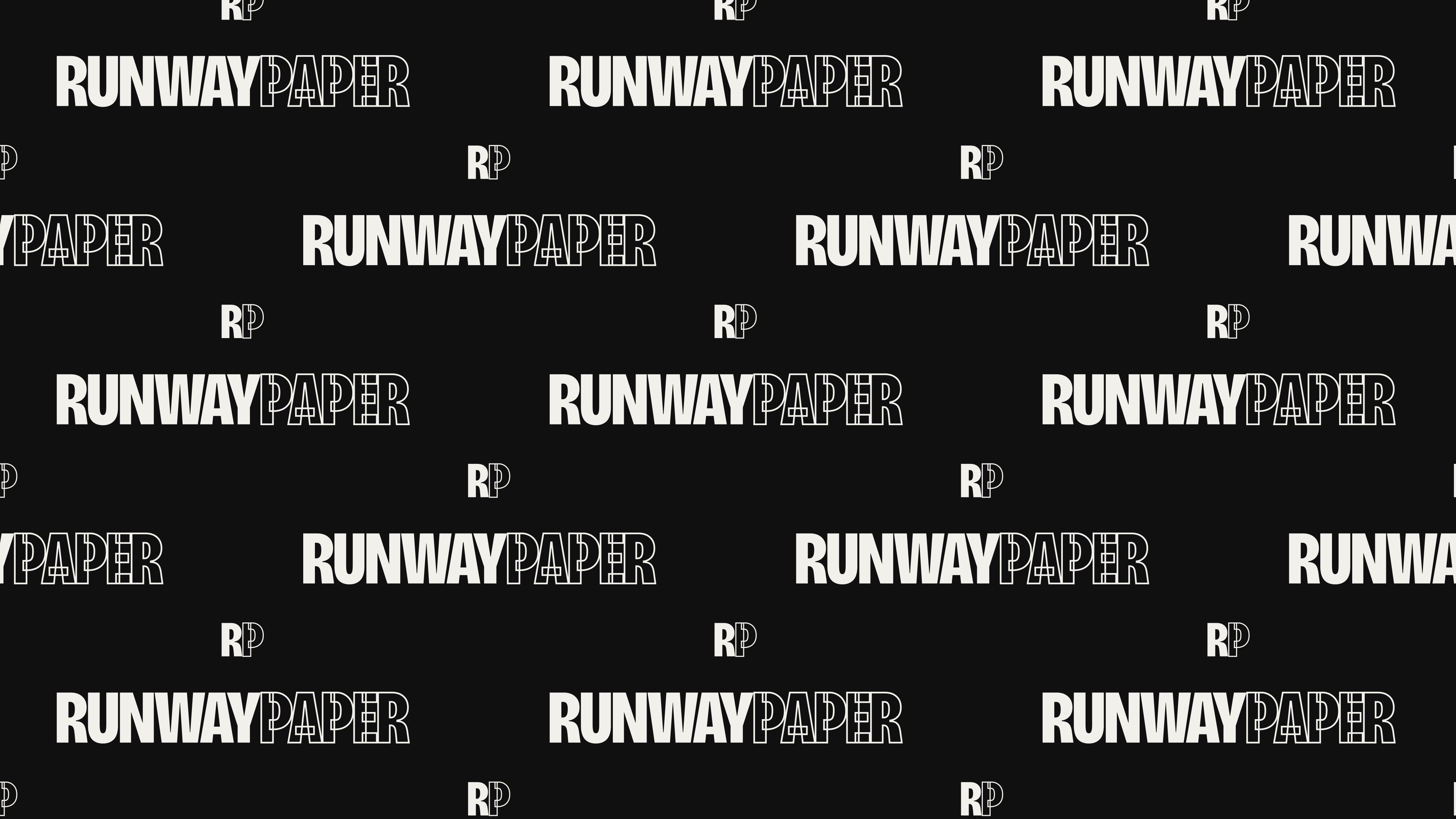
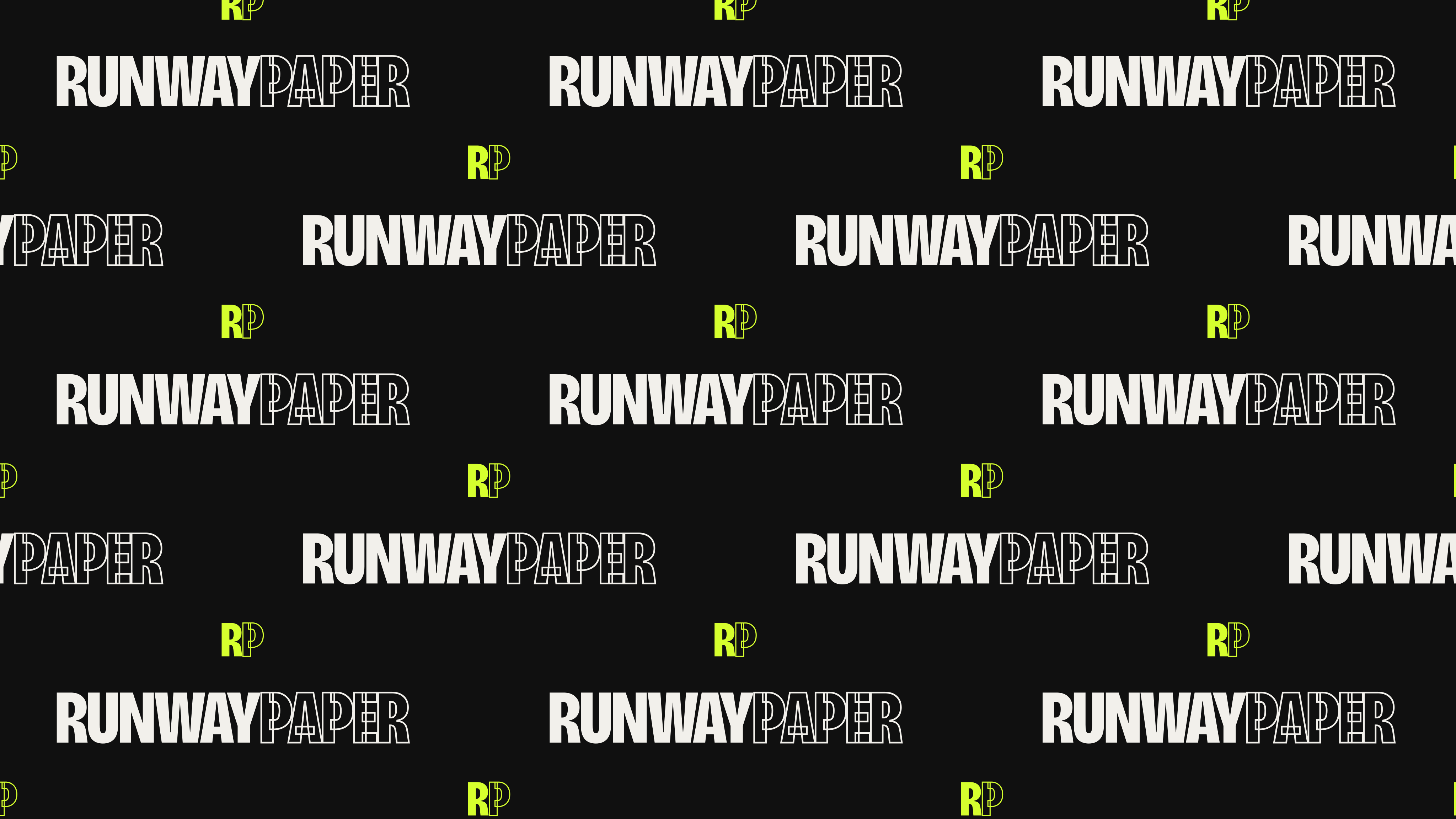
16:9 press-wall backdrop, pure vector — scales to any wall size. Wordmark rows brick-staggered, monograms in the gaps. Send the SVG straight to the printer.
Stickers
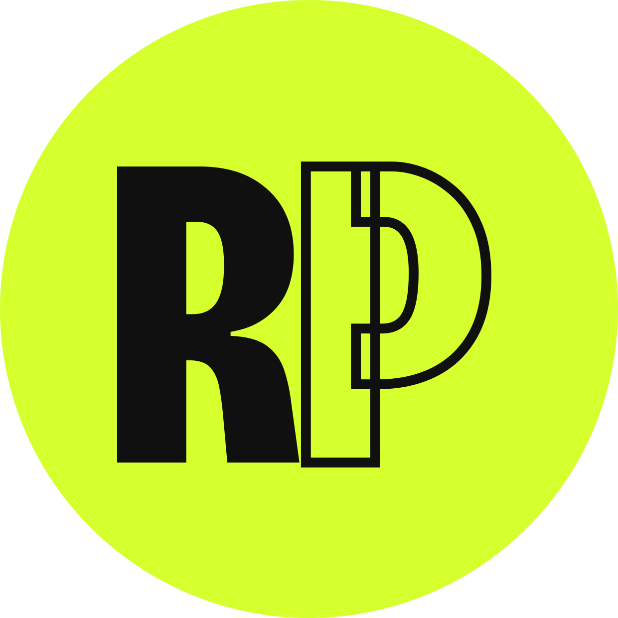
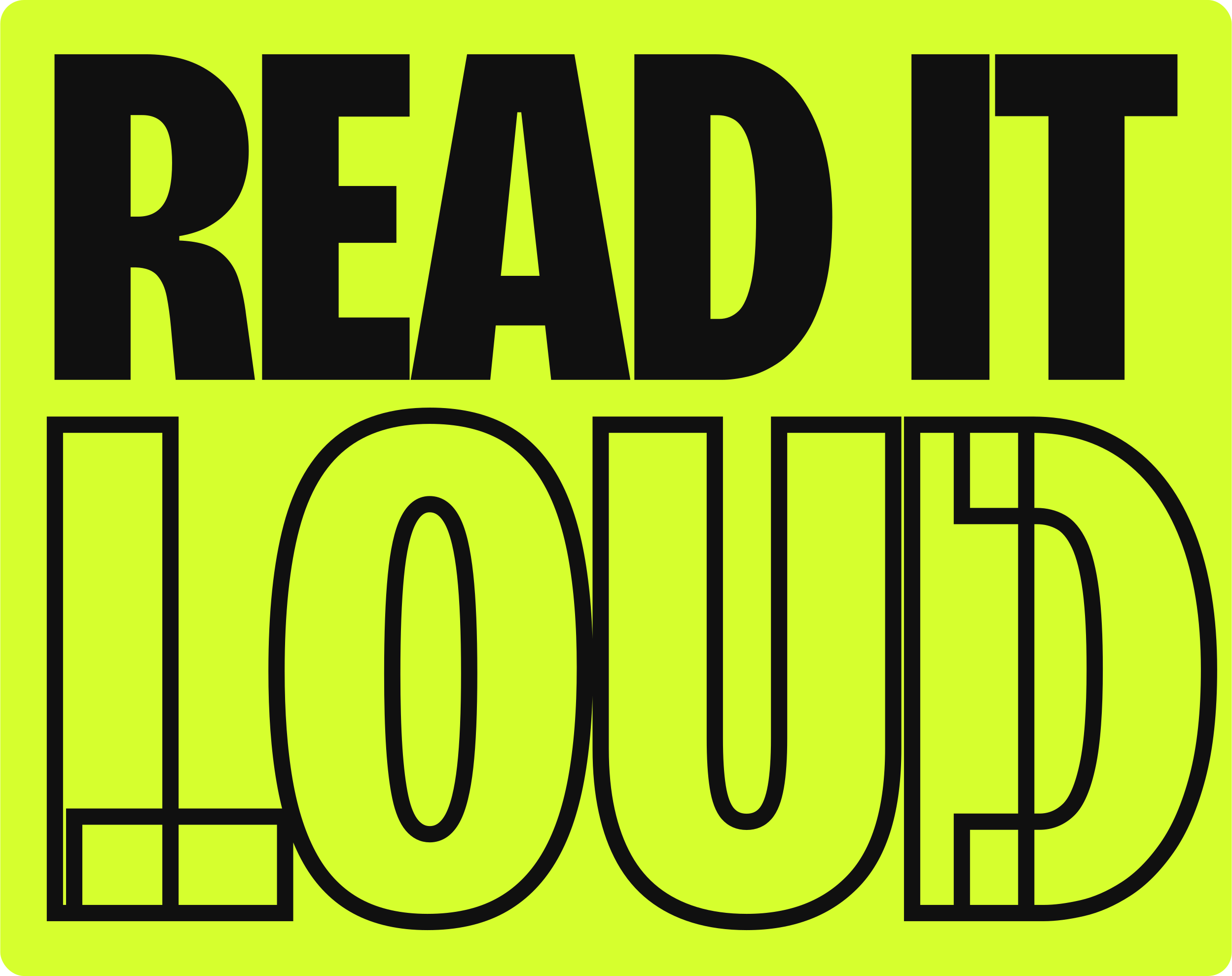
Die-cut ready — the outer shape is the cut line. Round monogram, wordmark pill, and the shout.


Colour
Ink dominates. Bone speaks. Acid interrupts — once per screen, or it stops working.
Typography
Bricolage
Grotesque
Fragment Mono — captions, credits, datelines, buttons, anything that behaves like a typewriter stamp. Usually 10–12px, uppercase, tracked +0.02 to +0.05em.
Rules
- DO Use the supplied SVGs — the type is outlined, no font needed.
- DO Keep clear space around the mark equal to the height of the R.
- DO Use the one-colour cut below ~120px wide — the outline fills in.
- DON’T Recolour outside ink / bone / acid.
- DON’T Swap which word is outlined. RUNWAY is solid. PAPER is the ghost.
- DON’T Add shadows, gradients, bevels, or place the mark over busy photography without a solid field.
- DON’T Re-typeset the logo. It is drawn once, at wght 800 / wdth 76 — use the files.
Voice
Confident, direct, a little confrontational. Short sentences. No hedging, no fashion-PR gloss.